Creating a distinctive identity often begins with an unusual name and BLU GNU certainly gave us plenty of creative inspiration.
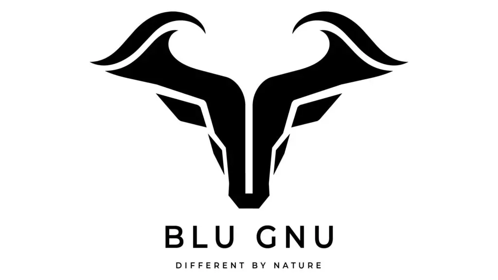
While we cannot reveal the purpose behind the brand just yet, the brief was to create a bold, abstract logo that brought together two very different ideas: the character and strength of a gnu with a clear coastal influence.
Rather than taking a literal approach, we explored how these elements could be combined through shape, movement and colour. The final design features strong, flowing forms that suggest both the distinctive profile of a gnu and the energy of rolling waves. The result is a confident visual identity that feels modern, memorable and full of personality.
A blue colour palette will reinforce the coastal connection while the abstract styling gives the logo flexibility across a wide range of applications. It is designed to work equally well as a complete brand mark or as a standalone symbol across digital platforms, printed materials, signage and merchandise.
A strong logo should do more than simply represent a name. It should create curiosity, communicate character and provide a solid foundation for the wider brand. BLU GNU achieves exactly that, offering a distinctive identity that hints at its inspiration without revealing everything at first glance.
For now, the story behind BLU GNU remains under wraps, but we are looking forward to sharing more when the time is right.