We are very pleased to be designing a new logo, corporate stationery and website for another international customer.
Gerrish legal are a new legal practice based primarily in Paris and approached us to create them a clean and simple logo based around a monochromatic theme.

As you can see we have produced a strong image based around the simple maze like character with a clean and simple typeface to compliment the clean lines of the brand. The typeface that has been chosen has carefully been researched so that it is available in a wide range of font weights as well as being print and web ready so we can use it across all media.
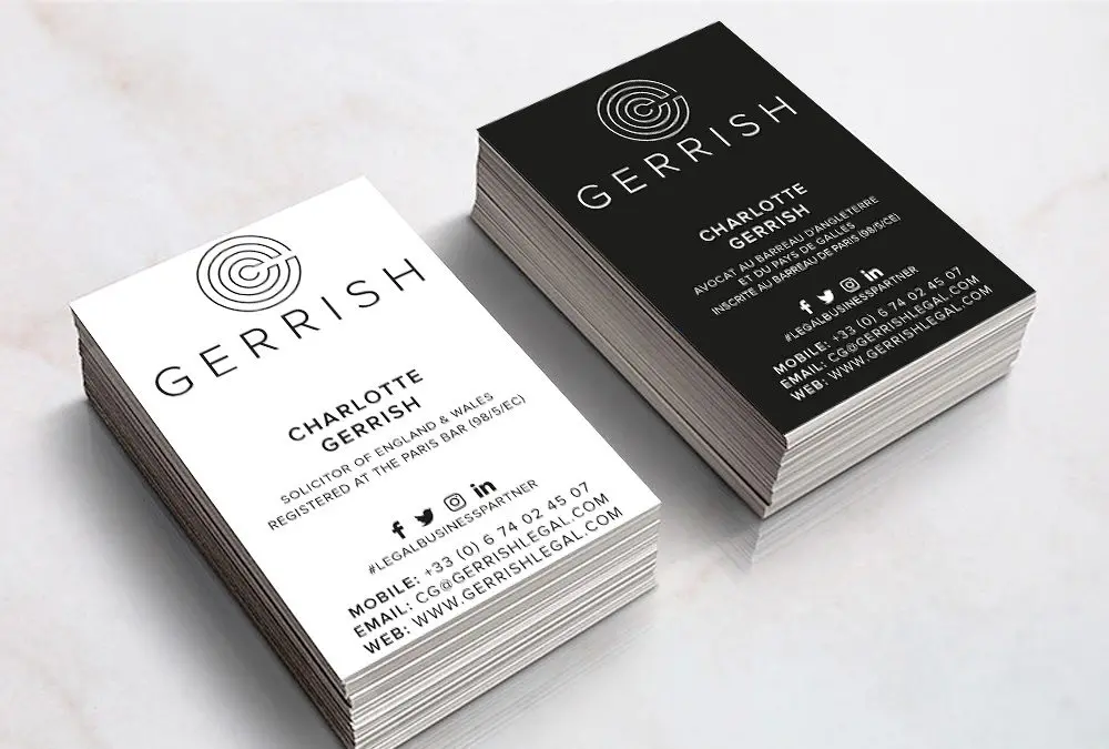
The corporate stationery is double sided again following the monochromtic approach with English language being black on white and French being the reverse and this theme is being followed through into the new website.
Watch our pages for full showcase on the brand and website design coming soon.
